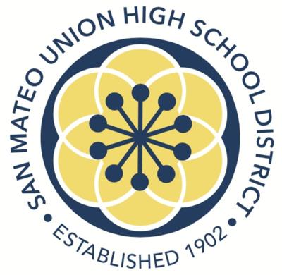
Honoring its 10 schools and six cities represented, the San Mateo Union High School District approved a new logo after using its previous hand-drawn seal for almost 50 years.
The old logo was difficult to reproduce for marketing purposes and didn’t fully encompass the district’s values, Superintendent Randall Booker said. Last year, the district had approved a need for a rebranding initiative.
The new design features a dark blue circle surrounding six gold overlapping circles, punctuated by 10 intersecting lines in the center.
“We are no longer a district of schools, we are surrounded by the outer circle in blue by a school district,” Booker said. “We recognize that we are the through line, the thread that holds our student community together and the values we represent as a school district.”
Perla Rodriguez — of Voler Strategic Advisors, who led the rebranding initiative — said the colors were chosen to reflect the duality of the bright hopefulness within the district as well as its classic high quality education. It honors the main colors of the current logo, but in a “slightly refreshed” way.
After gathering community input, the concept and symbol of a kaleidoscope was decided upon to properly reflect the noted values of the district.
“It’s defined as an optical instrument that consists of many reflections and surfaces and points of view,” Rodriguez said. “They represent an ever-changing organization, which this district is always striving to be better.”
The state recently approved the Bridge Program to become the district’s 10th school for the upcoming school year, aligning with the district’s rebranding initiatives.
Recommended for you
Bridge, a continuation program for English learners previously run in partnership with Peninsula High School, was awarded designation as its own school, and the district’s 10th, by the state of California earlier this month.
“It’s the difference in these 10 schools and these six cities that really gives us strength,” Booker said.
The adoption of the new logo was an extensive process inquiring input from students, parents and district employees over the course of one virtual and four in person focus groups and multiple surveys. These meetings gathered information for community members about how they see the district and what they hope would be translated in their new branding.
Laura Chalkley, manager of communications for the district, said this process was “one of the most heartening projects I’ve worked on” because of the amount of input gathered from its community meetings.
Though the board acknowledged art is subjective and everyone might not agree on the design, it’s ultimately a reflection of all the values and input noted over the last year. Student Board Representative Hiroki Maruyama said the design sends a message of timeless adaptability.
“This design reminds me of a cherry blossom or flower, where the district can grow and blossom or flourish in a way,” Student Board Representative Hiroki Maruyama said. “I feel good about this.”
With approval from the board, the finalized logo design will be incorporated into the new coming district website in July and all assets in time for the upcoming 2024-25 school year.
Keep the discussion civilized. Absolutely NO
personal attacks or insults directed toward writers, nor others who
make comments. Keep it clean. Please avoid obscene, vulgar, lewd,
racist or sexually-oriented language. Don't threaten. Threats of harming another
person will not be tolerated. Be truthful. Don't knowingly lie about anyone
or anything. Be proactive. Use the 'Report' link on
each comment to let us know of abusive posts. PLEASE TURN OFF YOUR CAPS LOCK. Anyone violating these rules will be issued a
warning. After the warning, comment privileges can be
revoked.
Please purchase a Premium Subscription to continue reading.
To continue, please log in, or sign up for a new account.
We offer one free story view per month. If you register for an account, you will get two additional story views. After those three total views, we ask that you support us with a subscription.
A subscription to our digital content is so much more than just access to our valuable content. It means you’re helping to support a local community institution that has, from its very start, supported the betterment of our society. Thank you very much!


(1) comment
Why does it look so similar to the coronavirus diagram? Horrible design.
Welcome to the discussion.
Log In
Keep the discussion civilized. Absolutely NO personal attacks or insults directed toward writers, nor others who make comments.
Keep it clean. Please avoid obscene, vulgar, lewd, racist or sexually-oriented language.
Don't threaten. Threats of harming another person will not be tolerated.
Be truthful. Don't knowingly lie about anyone or anything.
Be proactive. Use the 'Report' link on each comment to let us know of abusive posts.
PLEASE TURN OFF YOUR CAPS LOCK.
Anyone violating these rules will be issued a warning. After the warning, comment privileges can be revoked.